

Software
ConceptNexus
A business intelligence dashboard with live filters and CSV export.
A software interface concept for a services business: revenue, clients and project metrics in one workspace, with reporting periods and segments that recalculate instantly and a one-click CSV export.
Independent concept — designed and developed by TrueFrame Studio
- Type
- Independent concept
- Category
- Software
- Platform
- Web application
- Built with
- HTML · CSS · JavaScript
- Disciplines
- Custom Software, UI/UX Design
Screen 01 — Overview
Headline metrics, revenue trend and channel mix.
01Live demo
Try the working site.
Try this
- 01
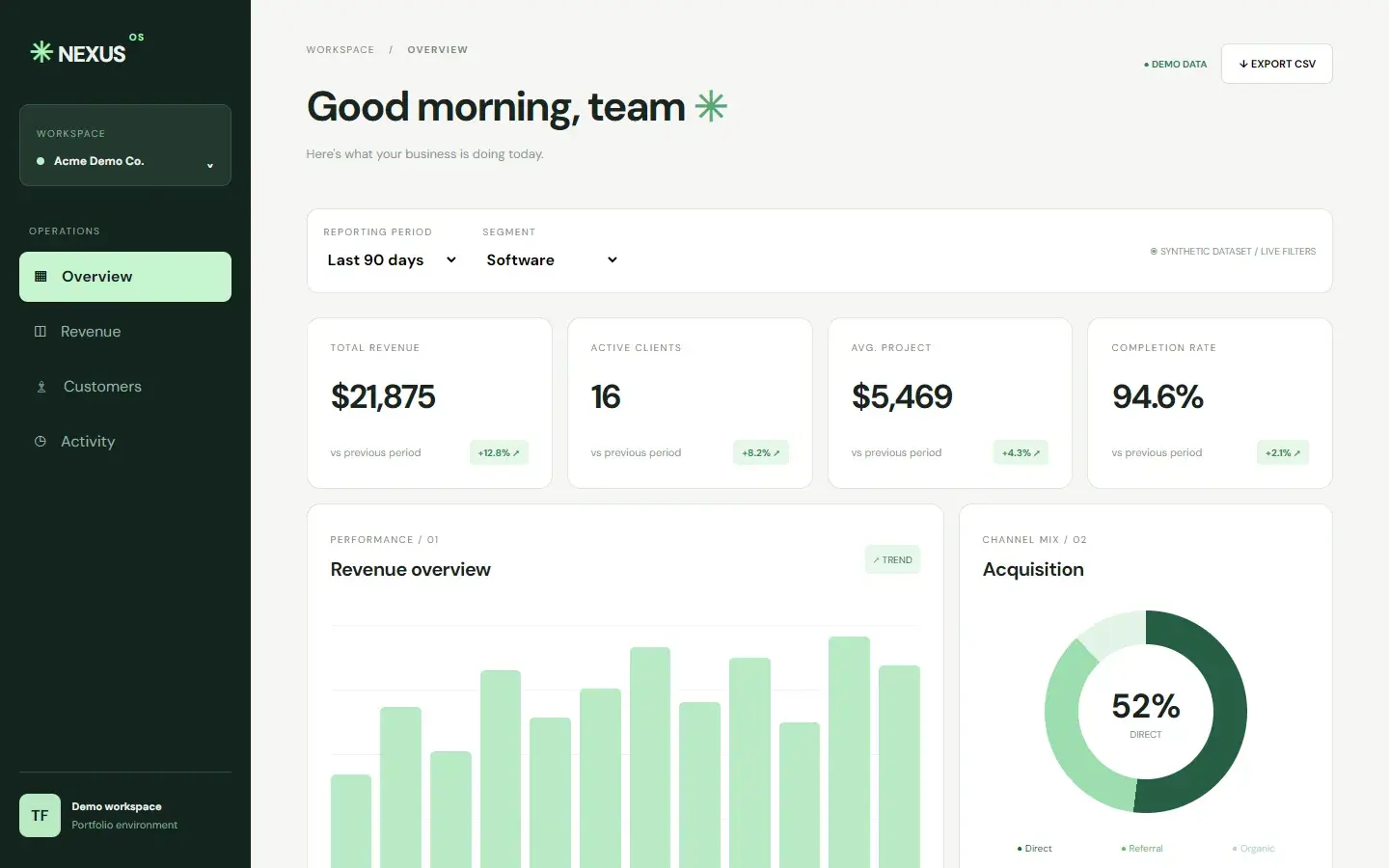
Change the reporting period or the segment and watch the figures recalculate.
- 02
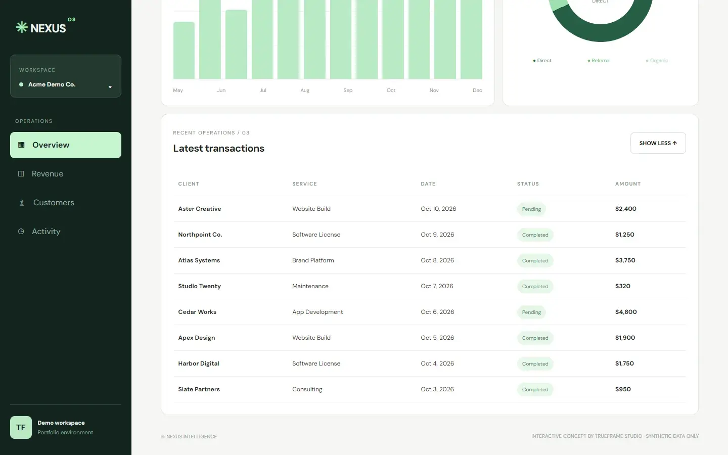
Expand the transactions with View all.
- 03
Export the current view as a CSV file.
- 04
Switch sections from the sidebar.
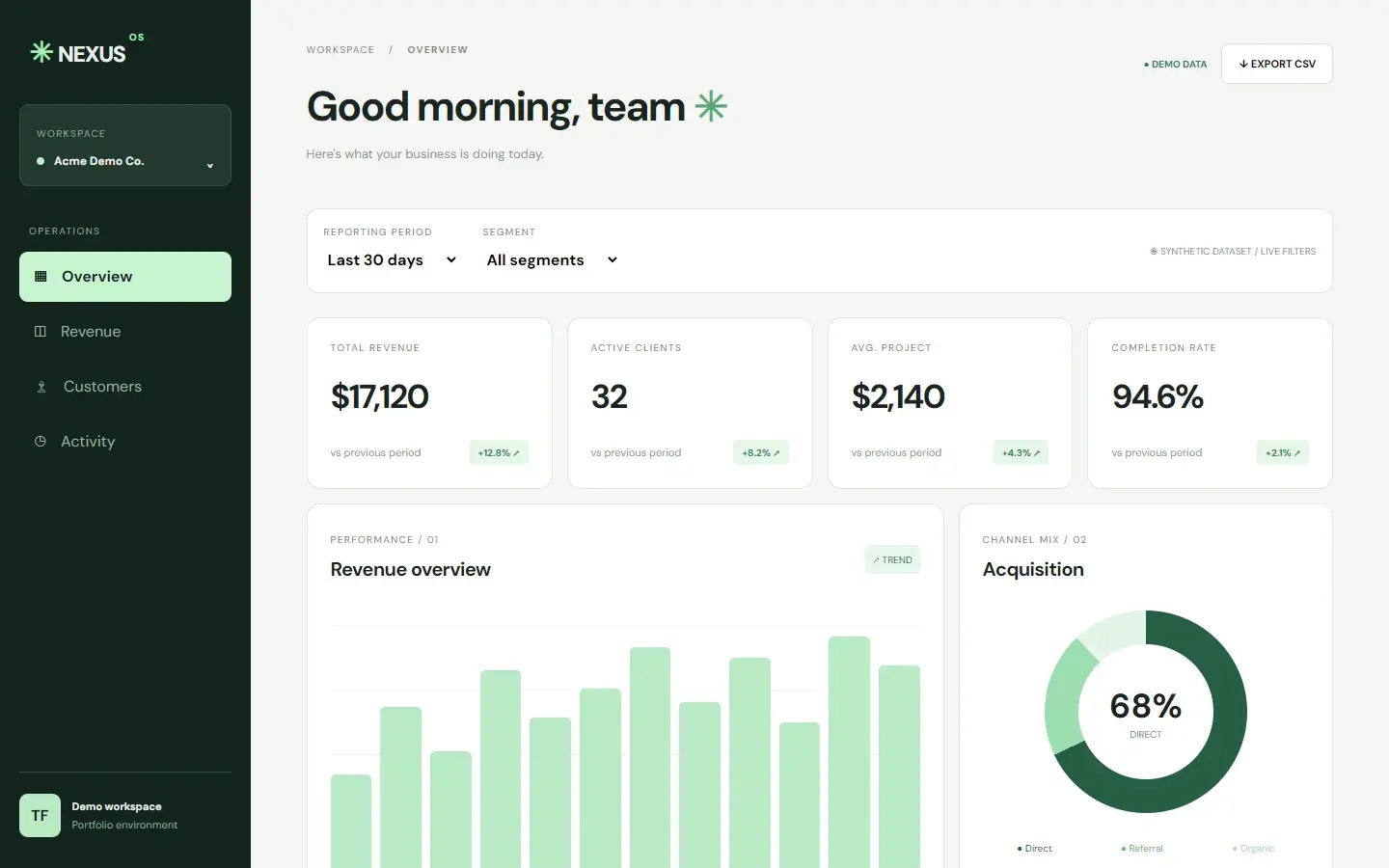
Key features
- 01
Live filters
Reporting period and segment recalculate the metrics and transactions instantly.
- 02
Revenue and channel views
A trend chart and an acquisition breakdown side by side.
- 03
CSV export
Download the current transactions view as a spreadsheet-ready file.
02Screens
Inside the product.
Responsive
Recomposed for every screen.
Navigation, hierarchy and controls are rebuilt for tablet and phone, not scaled down from the desktop layout.
Tablet768 px
Phone390 px
03Under the hood
How it was made.
- DM SansHeadings, metrics · 800
- DM SansLabels, tables · 400
- Forest#12241E
- Canvas#F5F6F4
- Mint#C6F5CE
- Signal#2C8B57
Nexus imagines the operations dashboard a growing studio or agency would open every morning: the headline numbers, a revenue trend, the channel mix and the latest transactions, all in one calm workspace.
01Brief and goalsWhat it set out to do · what it explores
Reporting period and segment filters recalculate the figures and the transactions instantly, the channel mix follows the segment, the transaction table expands on demand, and the current view exports to CSV. All data is synthetic.
Goals
- 01
Show the state of the business at a glance.
- 02
Let people slice the numbers by period and segment without waiting.
- 03
Get data out of the app in one click.
What the concept explores
- 01
A dashboard that stays readable when it holds a lot of information.
- 02
Filters that feel instant, with no loading states.
- 03
Interface design for internal software, not just public websites.
02Design decisionsLayout · Colour · Data visualisation · Interaction
- Layout
A sidebar that collapses, not disappears
A 260px sidebar holds the workspace switcher and four sections. Under 950px it becomes a 72px icon rail, under 600px a 50px one. Metric cards reflow from four columns to two, and the transactions table scrolls inside its own card.
WhyNavigation stays one tap away on a phone, and no panel is dropped just because the screen is small.
- Colour
One hue, used for meaning
Deep forest green for the sidebar; mint tints for the active section, the deltas and the status pills; white panels with hairline borders for the data itself.
WhyA single hue family keeps a dense screen calm. Colour marks what is active or changing, never decoration.
- Data visualisation
Charts in plain CSS
The revenue chart is a row of flex columns with percentage heights and CSS-only tooltips; the channel mix is a conic-gradient donut. No chart library is loaded.
WhyFor a handful of numbers, CSS draws the picture instantly and keeps the dashboard as light as a web page.
- Interaction
Instant, honest data
Period and segment selects recalculate the figures in place with no loading states. View all expands the table, Export CSV downloads exactly the rows in the current view, and a Demo data label stays on screen.
WhyPeople trust a dashboard that responds immediately and says plainly where its numbers come from.
03Build and technologiesHTML · CSS · JavaScript
HTML
An app layout: sidebar navigation, a main workspace and a semantic table for transactions.
CSS
Hand-written: flex and grid panels, a CSS-only bar chart, a conic-gradient donut and a sticky sidebar that collapses at 950px and 600px.
JavaScript
app.js holds a synthetic dataset, applies the period and segment filters, recalculates the metrics, expands the table, switches sections and builds the CSV export as a Blob download.
Google Fonts
DM Sans, from 400 to 800, for the whole interface.
Synthetic data
Every client, amount and date is invented for the demo. No real business data is used.
Static hosting
Plain files served from /showcase/nexus. No framework, no API, no database.
Services in this concept
04ProcessDiscover · Plan · Design & Develop · Launch & Support
01Discover
Identify the handful of numbers a business owner actually checks each day.
02Plan
Design the information hierarchy: metrics, trends, mix and the transaction detail.
03Design & Develop
Build the interface, the filter logic and the export on synthetic data.
04Launch & Support
Test responsiveness down to phones and keep every interaction instant.
Concept study. Nexus is an independent concept, designed and built by TrueFrame Studio to show how we approach this kind of product. There is no client, and no results are claimed.