

Websites
ConceptAthletic Dept.
A bold training-club website with an interactive class schedule.
A high-energy brand site for a training club: heavy type, monochrome photography with an electric accent, program cards, and a weekly schedule visitors can browse day by day.
Independent concept — designed and developed by TrueFrame Studio
- Type
- Independent concept
- Category
- Websites
- Platform
- Responsive website
- Built with
- HTML · CSS · JavaScript
- Disciplines
- Website Development, UI/UX Design
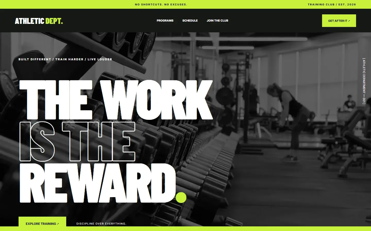
Screen 01 — Home
The statement hero with the club's promise.
01Live demo
Try the working site.
Try this
- 01
Switch days in the schedule to see each day's classes.
- 02
Jump to the programs or the schedule from the navigation.
- 03
Scroll the bands from the hero down to the call to join.
Key features
- 01
Statement hero
Monochrome photography and stacked type with a single electric accent.
- 02
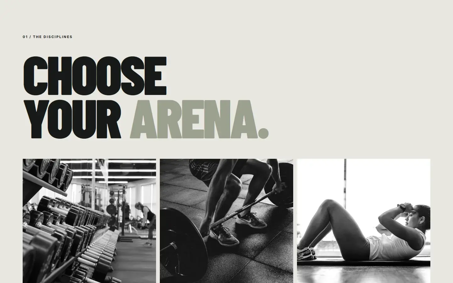
Discipline cards
Strength, conditioning and performance, each with its own image and promise.
- 03
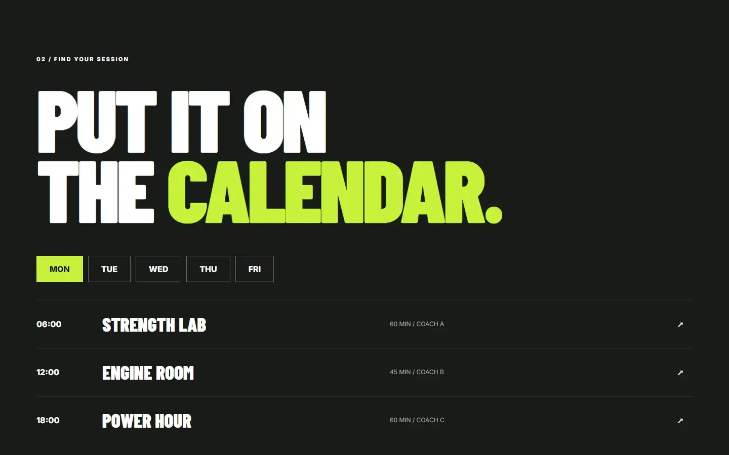
Weekly schedule
Switch days to see each session's time, class and length.
02Screens
Inside the product.
Responsive
Recomposed for every screen.
Navigation, hierarchy and controls are rebuilt for tablet and phone, not scaled down from the desktop layout.
Tablet768 px
Phone390 px
03Under the hood
How it was made.
- Barlow CondensedDisplay · 900
- InterText, labels · 400–800
- Lime#C8F13B
- Black#151815
- Concrete#E7E7DF
- Ash#9BA18F
Athletic Dept. explores how a training club can feel as intense online as it does in the room. The site uses oversized condensed type, monochrome photography and a single electric accent to carry the energy.
01Brief and goalsWhat it set out to do · what it explores
Visitors move from the brand promise to three training disciplines, then into a weekly schedule they can browse day by day. Classes are sample content; no bookings are taken.
Goals
- 01
Make the club's energy obvious in the first screen.
- 02
Explain the training disciplines quickly and visually.
- 03
Make the weekly timetable easy to scan on a phone.
What the concept explores
- 01
A loud, confident brand that stays usable.
- 02
Schedule browsing designed for phones first.
- 03
How a single accent colour can carry an entire identity.
02Design decisionsTypography · Colour · Layout · Interaction
- Typography
Type as the loudest element
Barlow Condensed at weight 900 sets the headline at up to 245px with a 0.75 line height. The middle line, IS THE, is outlined (a 2px text stroke over a transparent fill), and the full stop is lime.
WhyAlternating solid and outlined lines gives a three-line headline rhythm and energy without adding another typeface.
- Colour
One electric accent
Every photograph is turned greyscale and darkened. A single lime marks the top bar, the ticker band, the active day, the buttons and the closing section.
WhyMonochrome images make the accent impossible to miss, and the whole identity holds together with one colour.
- Layout
Bands that pace the page
Full-width bands alternate light, dark and lime: top bar, dark header, hero, ticker, programs, a dark schedule, then a lime call to join.
WhyA long, loud page reads in chapters, and each change of colour signals the next step towards joining.
- Interaction
A schedule built for thumbs
Weekday buttons switch the class list in place. Classes come from a small data object, and on phones each row drops the length and coach column to keep the time and class name large.
WhyMembers check a timetable on their phones between other things. One tap per day and big type make that quick.
03Build and technologiesHTML · CSS · JavaScript
HTML
One page: hero, disciplines, schedule and a call to join, linked by in-page navigation.
CSS
Hand-written: full-width colour bands, outlined type with a text stroke, greyscale photo filters and a card grid that goes from three columns to one.
JavaScript
app.js stores the weekly timetable as data, builds the day buttons and renders the chosen day's classes.
Google Fonts
Barlow Condensed for display, Inter for text and labels.
Unsplash
Training photography, filtered to greyscale in CSS rather than edited.
Static hosting
Plain files served from /showcase/athletic-dept. Sample classes only; no bookings are taken.
Services in this concept
04ProcessDiscover · Plan · Design & Develop · Launch & Support
01Discover
Understand how members choose a club: atmosphere first, then the timetable.
02Plan
Lead with the brand, then disciplines, then the schedule and the call to join.
03Design & Develop
Design the bold type system and build the site and interactive schedule.
04Launch & Support
Check the schedule on small screens and keep photography fast to load.
Concept study. Athletic Dept. is an independent concept, designed and built by TrueFrame Studio to show how we approach this kind of product. There is no client, and no results are claimed.