
Websites
ConceptMonoform
An editorial website for an independent architecture practice.
A minimal portfolio site for an architecture studio: oversized asymmetric typography, generous whitespace and full-bleed photography that lets the work carry the page.
Independent concept — designed and developed by TrueFrame Studio
- Type
- Independent concept
- Category
- Websites
- Platform
- Responsive website
- Built with
- HTML · CSS
- Disciplines
- Website Development, UI/UX Design
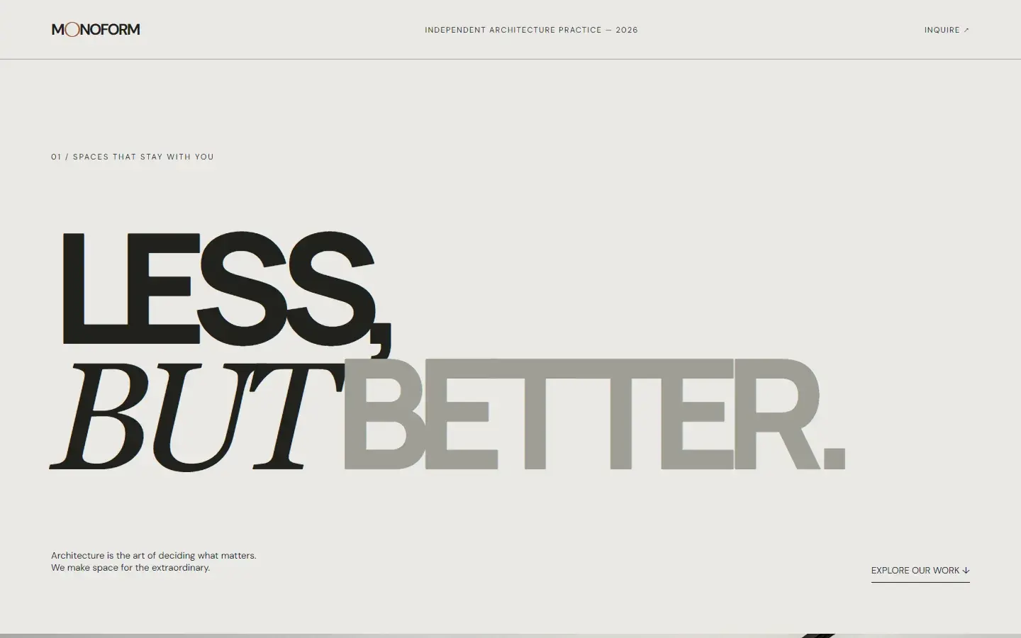
Screen 01 — Home
The statement headline: less, but better.
01Live demo
Try the working site.
Try this
- 01
Reload the page to see the hero photograph settle into focus.
- 02
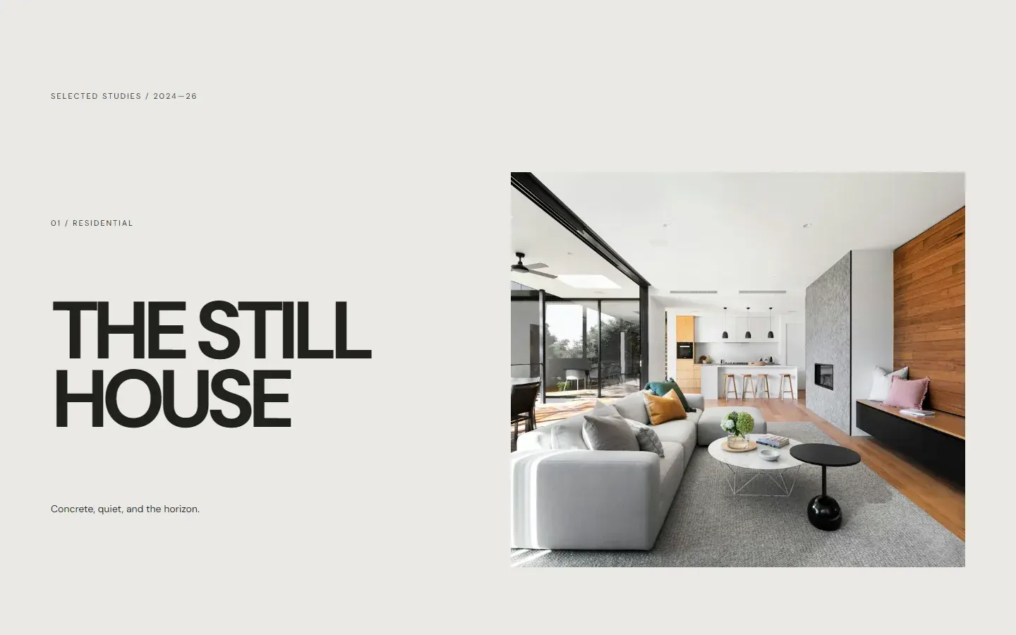
Scroll the selected studies as they alternate sides.
- 03
Follow Inquire in the header down to the closing line.
Key features
- 01
Statement typography
An oversized, asymmetric headline sets the studio's point of view.
- 02
Full-bleed studies
Large photography with minimal captions keeps the focus on space and light.
- 03
Single inquiry
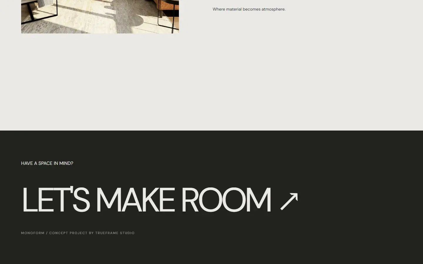
One oversized line, Let's make room, closes the page as its only call to action.
02Screens
Inside the product.
Responsive
Recomposed for every screen.
Navigation, hierarchy and controls are rebuilt for tablet and phone, not scaled down from the desktop layout.
Tablet768 px
Phone390 px
03Under the hood
How it was made.
- ManropeDisplay · 800
- GeorgiaItalic accent
- DM SansText · 400–700
- Stone#EAE9E4
- Grey#9E9E95
- Ink#20211D
- Rust#A65E35
Monoform imagines a website for a small architecture practice that values restraint. The page is built like a printed monograph: a single bold statement, a full-bleed study of light, then selected projects presented one at a time.
01Brief and goalsWhat it set out to do · what it explores
Everything that isn't the work is pared back to thin rules, small captions and a single call to inquire.
Goals
- 01
Present architectural work with the calm of a printed book.
- 02
Let typography and whitespace do the branding.
- 03
Keep one clear path to an inquiry.
What the concept explores
- 01
Minimalism that still feels warm and human.
- 02
Typography as the main brand element.
- 03
Portfolio presentation for creative and architectural practices.
02Design decisionsTypography · Layout · Colour · Motion
- Typography
Three voices in one headline
LESS, BUT BETTER. mixes Manrope ExtraBold with very tight tracking (−0.11em), a Georgia italic BUT and a grey BETTER, at up to 260px. The rest of the page is small DM Sans.
WhyThe headline states the practice's point of view and does the branding, so the header can stay a thin rule with a wordmark.
- Layout
Paced like a monograph
A statement, then a full-bleed photograph at 80% of the screen height, then selected studies that alternate image and text sides on an uneven two-column grid, with spacing set in viewport units.
WhyEach project gets its own spread, as a printed book would present it, and the spacing grows and shrinks with the screen.
- Colour
Stone, ink and one rust note
A stone background, near-black ink and a mid grey. The only colour is rust, used once, on the O of the wordmark; the footer inverts to near-black.
WhyArchitectural photography brings its own colour. The site stays neutral so the materials in the photographs do the talking.
- Motion
One animation, no JavaScript
The hero photograph settles in over 1.5 seconds, scaling down from 110% as it comes into focus, using a single CSS keyframe. There is no JavaScript on the page at all.
WhyRestraint suits a practice built on it, and a page with nothing to run loads fast and has nothing to break.
03Build and technologiesHTML · CSS
HTML
One page: statement, full-bleed study, selected projects and an inquiry footer.
CSS
Hand-written: an uneven grid with alternating image order, viewport-unit spacing, vertical writing-mode labels and one keyframe animation.
No JavaScript
Everything, including the hero reveal, is HTML and CSS.
Google Fonts
Manrope for the headline, DM Sans for text, with Georgia for the italic.
Unsplash
Architectural photography served from Unsplash's image CDN.
Static hosting
Plain files served from /showcase/monoform. No framework, no build step, no backend.
Services in this concept
04ProcessDiscover · Plan · Design & Develop · Launch & Support
01Discover
Learn how architecture clients judge a practice: the work, the point of view, the restraint.
02Plan
Structure the site like a monograph: statement, study, selected projects, inquiry.
03Design & Develop
Design the editorial type system and build the responsive site around large imagery.
04Launch & Support
Tune image sizes so full-bleed photography stays fast.
Concept study. Monoform is an independent concept, designed and built by TrueFrame Studio to show how we approach this kind of product. There is no client, and no results are claimed.