

Websites
ConceptDaybreak
A warm, playful website for a neighbourhood café.
A friendly café site with sunny colour, characterful type and an interactive menu: switch between coffee, bakery and other drinks and the list and photography update together.
Independent concept — designed and developed by TrueFrame Studio
- Type
- Independent concept
- Category
- Websites
- Platform
- Responsive website
- Built with
- HTML · CSS · JavaScript
- Disciplines
- Website Development, UI/UX Design
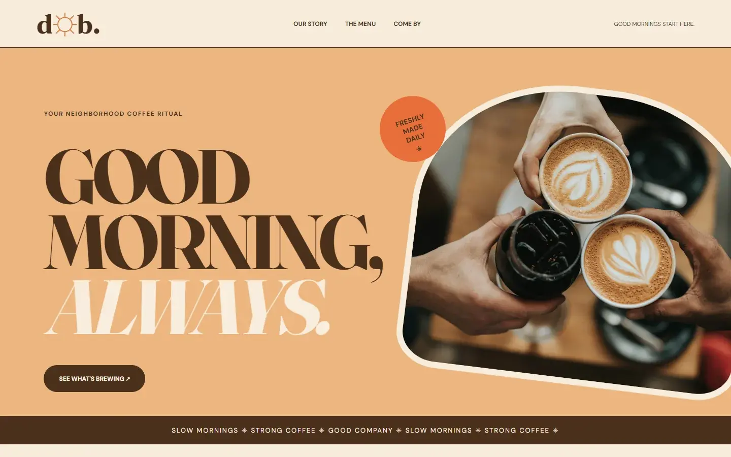
Screen 01 — Home
A warm hero with the café's personality.
01Live demo
Try the working site.
Try this
- 01
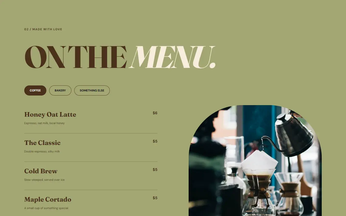
Switch the menu between coffee, bakery and something else.
- 02
Watch the arched photograph change with each tab.
- 03
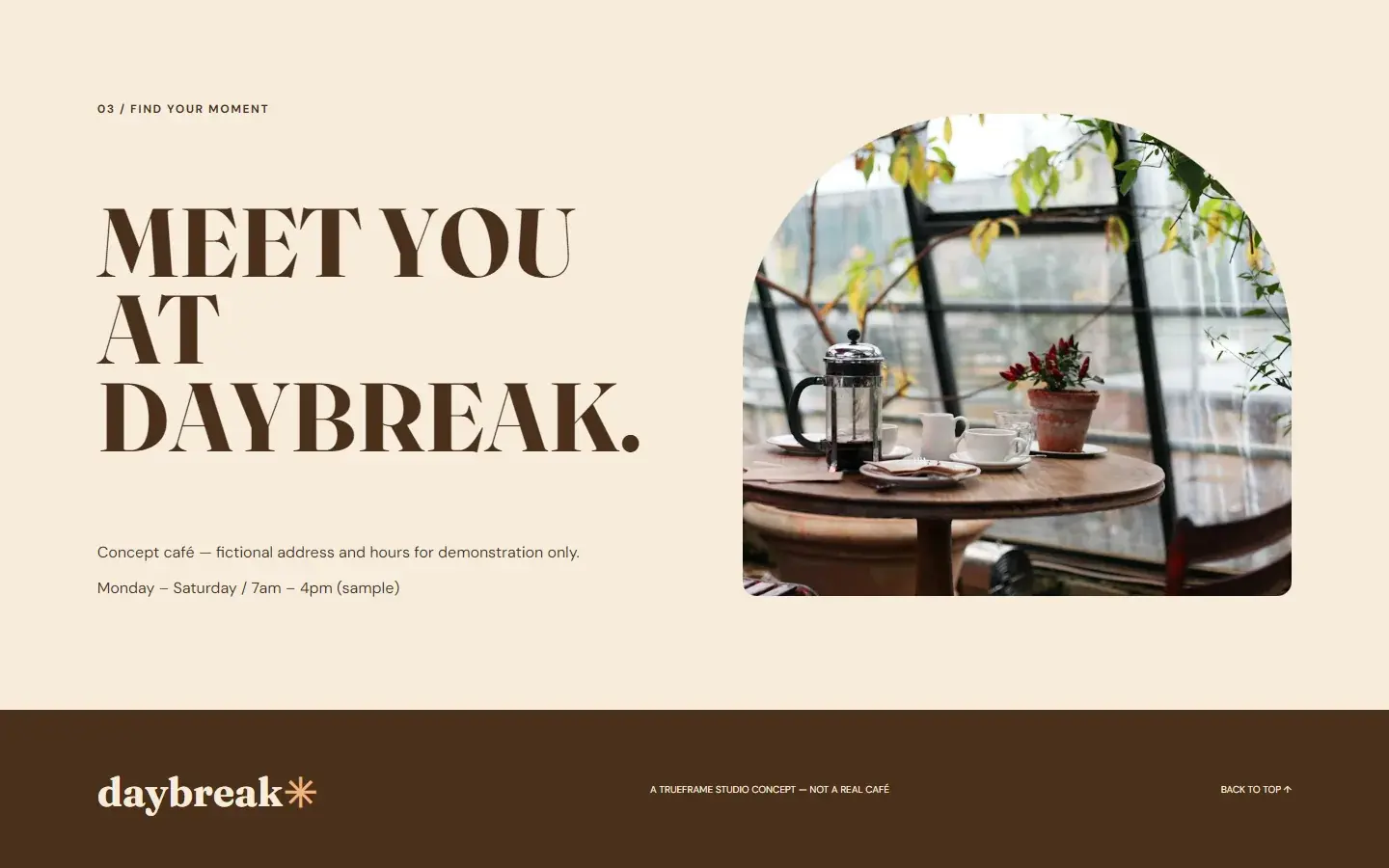
Jump to the story, the menu and the visit section from the header.
Key features
- 01
Characterful hero
Warm colour, a soft serif and a playful sticker set the mood.
- 02
Tabbed menu
Coffee, bakery and other drinks switch the list and image together.
- 03
Visit section
Sample opening hours beside an arched photograph.
02Screens
Inside the product.
Responsive
Recomposed for every screen.
Navigation, hierarchy and controls are rebuilt for tablet and phone, not scaled down from the desktop layout.
Tablet768 px
Phone390 px
03Under the hood
How it was made.
- FrauncesDisplay · 700, soft
- DM SansText, labels · 400–800
- Cream#F7EDDB
- Peach#EDB580
- Olive#A3A773
- Sticker#E76F39
- Espresso#4B301D
Daybreak shows the opposite end of the studio's range: a small neighbourhood café with a warm, welcoming personality. A soft serif, sunny tones and playful details like the tilted sticker and the ribbon of brand lines make it feel like a real place.
01Brief and goalsWhat it set out to do · what it explores
The menu is the working part: tabs switch between coffee, bakery and other drinks, updating the list and the photograph together. The opening hours are sample content.
Goals
- 01
Make a small business feel warm and personal online.
- 02
Put the menu, the thing people actually look for, front and centre.
- 03
Keep the site light and fast on phones.
What the concept explores
- 01
Range: the same studio designing for warmth instead of minimalism.
- 02
A simple interactive menu that small businesses can maintain.
- 03
Personality through type, colour and small details.
02Design decisionsTypography · Shape · Colour · Interaction
- Typography
A soft, characterful serif
Fraunces at weight 700, with its soft and wonky variations switched on, gives rounded, slightly quirky letterforms; italic words switch colour inside the headlines. DM Sans in heavy capitals handles the labels.
WhyThe type does the job a logo usually does: it makes the café feel friendly and specific before a single photograph loads.
- Shape
Arches instead of rectangles
Photographs are cut into arches with large rounded tops. The hero arch is tilted 7° inside a cream border, the sticker is a circle turned −18°, and every button and tab is a pill.
WhySoft shapes read as warm and hand-made, and they set the site apart from the square grids most templates use.
- Colour
A palette taken from breakfast
Cream, espresso brown, peach, olive and a burnt-orange sticker. Each section changes its background, so scrolling moves from peach to cream to olive and back.
WhyChanging grounds give a single page the feeling of moving through a place, and every colour belongs on the menu.
- Interaction
One useful interaction
Three menu tabs swap the item list and the arched photograph together. The menu is a small data object, kept separate from the layout.
WhyThe menu is what visitors come for, and keeping it as data means items and prices can change without touching the design.
03Build and technologiesHTML · CSS · JavaScript
HTML
One page: hero, story, menu, a quote band and a visit section, linked by in-page navigation.
CSS
Hand-written: arched image shapes, a rotated hero image and sticker, pill buttons, coloured section bands and a 760px phone recomposition.
JavaScript
app.js stores the three menus and their photographs as data; the tabs re-render the list and swap the image.
Google Fonts
Fraunces (with its soft and wonky axes) for display, DM Sans for text.
Unsplash
Café and menu photography served from Unsplash's image CDN.
Static hosting
Plain files served from /showcase/daybreak. The café, hours and prices are fictional.
Services in this concept
04ProcessDiscover · Plan · Design & Develop · Launch & Support
01Discover
Find out what café visitors look for first: the menu, the hours and the feel of the place.
02Plan
Lead with the mood, then the menu, then how to visit.
03Design & Develop
Design the warm visual system and build the site and the tabbed menu.
04Launch & Support
Keep the page light for phones on a slow connection.
Concept study. Daybreak is an independent concept, designed and built by TrueFrame Studio to show how we approach this kind of product. There is no client, and no results are claimed.